


Ever have that feeling like your website is starting to become dated or doesn’t align with your values anymore? In mid-2019, we had this feeling. This initiated the need to refresh our brand and inevitably redesign our website.
The first step of this process was to establish our new brand identity and understand what exactly we needed our website to do. We then built a plan that was used as the guide for the entire website project.
Our creative team utilized this plan to craft modern and engaging design that our development team used to build the website in mid-2020. While the journey was difficult, it was exceptionally rewarding. Here is a breakdown of that journey – from concept to reality.
Discovery
During the discovery process, we get all stakeholders together and distill what direction to take the website. There is a decent amount of information needed for a successful website redesign strategy.
Target Audience
Who is this website built for? This is arguably the most important question. The website should be catered to whoever is going to be using it. Different users are going to be looking for different content and have different reasons for using the website.
We established with the stakeholders that our target audience consists of CMOs, marketing directors, and marketing managers. We created a loose persona document that established the main goals and needs of each persona, to help frame what we needed to address with the updated website.
Competitor Analysis
What are the current trends in the industry? Looking at your competitors is vital to simplifying the user experience and messaging for the target audience. When building the architecture and messaging, it’s important to analyze competitors to see how you compare.
From this phase, we concluded that our main competitors were using trust signals effectively, but the overall user experience was lacking.
Understand Your Brand
What should the website look like? What the website will look like will depend on the established branding guidelines. If these do not exist, they should be created. If they do exist, it’s important to understand the current guidelines so the website aligns with the brand.
Our branding guidelines before we started on this journey were basically non-existent, so we had to build up our brand identity from scratch.
Don’t repeat past mistakes
What are the shortcomings of the existing website? The last thing we want to do is repeat the mistakes of the past. A full audit of the existing website should be completed to understand what the existing website could do better. Secondly, an analysis on the stakeholder’s opinions on the shortcomings of the website can yield valuable information as well.
Here are some solutions we wanted to add to the new website:
- Make the navigation easier to use with a mega-menu.
- Create a case study page template so we can promote our clients’ successes.
- Rewrite key website content so it’s easier to read and understand.
- Restructure content so it’s easier to scan and find what the user is looking for.
- Add clear calls to action at the bottom of main website pages to give the user an idea of where to go next.
- Make sure the mobile version of the website is easy to use.
Planning
Once we have all the information needed to understand what we need to fix on the website, we enter the website planning phase. This includes site navigation, a sitemap, moodboards, and wireframes.
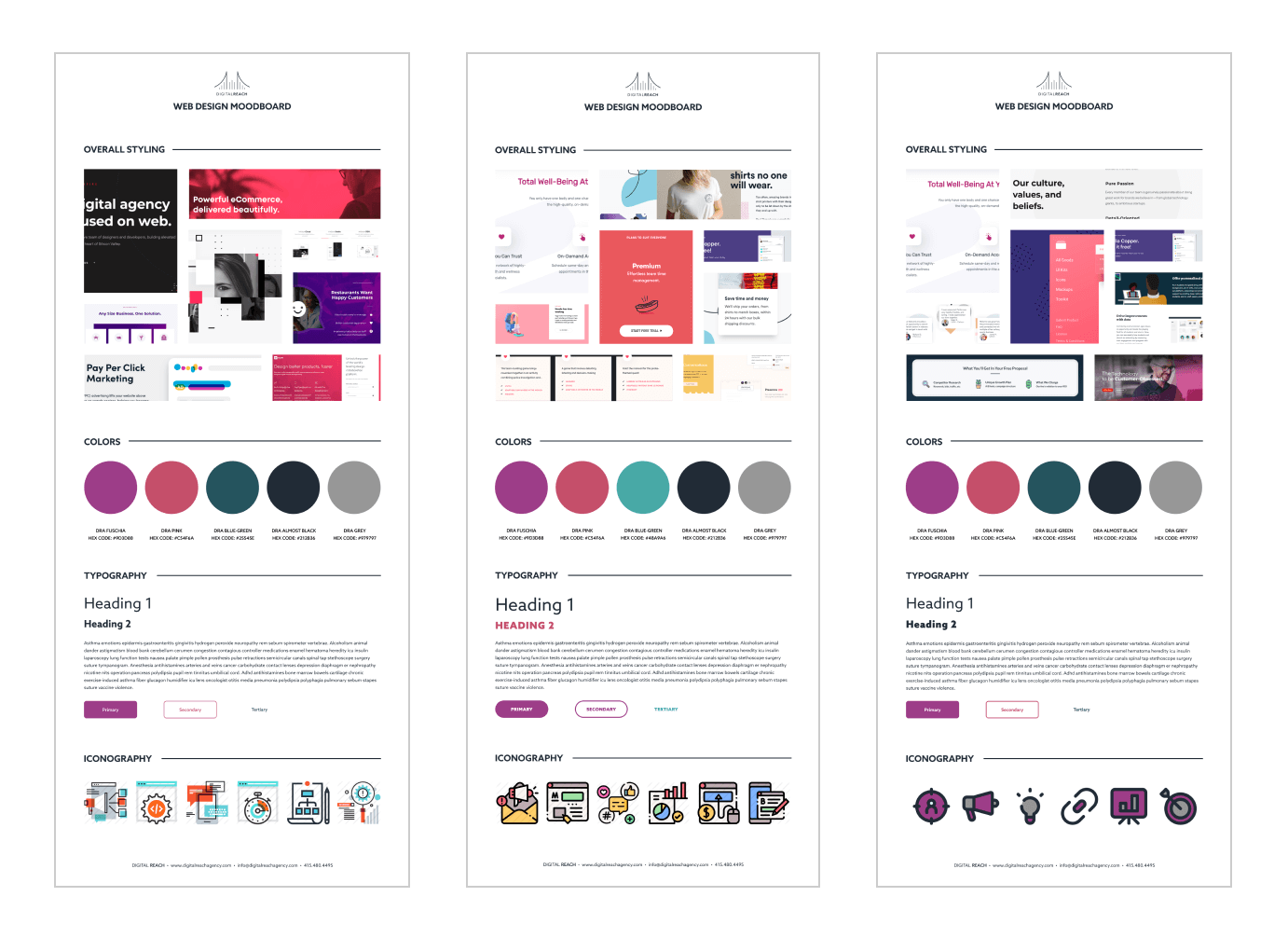
The Mood Board
The mood board establishes the look and feel of the website. We usually use mood boards when there are no brand guidelines, or when brand guidelines feel outdated. We created 3 initial versions, each based on 2 brand values that we had determined in the project discovery. After 2 rounds of revisions, we ended up with a final mood board that helped act as a compass for the website’s look and feel, as well as for the brand guidelines.
The Architecture
Another important aspect of building the guide for a website is the sitemap and site navigation. The site architecture determines the order of content and how it will be used. To ensure our website is user-friendly and provides the best user experience possible, we referred back to information collected during the discovery process. The competitor analysis, the website audit, and information about the target audience are key for this step of the process.
We kicked off our architecture by building out a sitemap that lists all pages for the new website. We used Airtable to build an interactive spreadsheet that visually showed the hierarchical structure of the content for the new website. Once the sitemap was completed, we included a review from our SEO team to ensure we fully optimized the way the URLs of the new pages were structured.
The next step is to establish the global header and footer navigation for the website. We used Slickplan, which allows us to build a visual representation of the navigation. Our website’s navigation structure was broken out into the main menu and top/footer menus, which you can see above and below this post.
Once the architecture is established, this concludes the planning phase. We know what to include on the website and where to include it. From here, we can start to build a content outline, develop the content, and craft wireframes.
Content Strategy
This is the point of the project where content is created. We start with a content outline for each page. Again, it’s important to rely on the information acquired during the discovery phase to craft the content. The terminology used, the information sought by the user, and the voice & tone are all things that should be understood in the discovery process and used to write the content.
On our previous website, the content was a major pain point. It did not convey the message that best represented what we do. It did at one time, but as we grew and adapted our approach to digital marketing, the content became more and more out of sync. We first established a general value proposition and brand voice and tone document during the discovery phase. From there, we created a content outline for each and every page, which was then utilized by our amazing content writing team to produce the content. They took all the important information we learned from the discovery process and applied it to the crafted content.

With a content outline, our creative team was able to get started on the wireframes, but final content is needed before mockups can begin.
Design
Wireframes
For each like-kind page defined in the sitemap, we take the content or content outline and determine the layout of the content using wireframes.
Wireframes visually show the “bones” of the page and do not show the imagery, color palette, and other design aspects.
Our creative team put together a set of wireframes using Figma, which enabled us to collaborate more easily with the entire team and get buy-in from our leadership team.
Style Guide, Imagery, and Iconography
Our process includes the creation of a style guide that defines global styling for things like:
- Color Palette
- Typography (Headers, paragraphs, list items, etc.)
- Iconography & Imagery
- Photographic Styling
This helps both the development and creative teams complete their respective tasks.
Mockups
Our mockups serve as a high-fidelity depiction of what each type of page will look like. This is one of the most exciting parts of the project because it’s the first time we see the website visually, as a whole.
Again, we utilized Figma to create our mockups, using the wireframes as a starting point. Figma is great for communicating the exact styles to a development team. The elements in the mockups provide styling rules developers can translate to code. It makes it much easier to develop a website that matches the finalized mockups.
Development Handoff
Once mockups are completed for the development team to reference and utilize, everything is optimized, packaged up, and sent to the development team to build.
Development
The development of the website is possibly the most time-consuming part of the project. This is the part where all the planning and design material is taken and built into reality.
Overall, when building a website our focus is on 4 essential things:
- User-friendliness
- Page load speed
- SEO and lead generation
- Modularity and scalability of the code
DRAmatic
When building WordPress websites, we start with our custom-built in-house theme for WordPress, called DRAmatic. It’s a modular block-based theme, which provides the following benefits:
- Easy content management. You don’t have to worry about “breaking” a page.
- Optimized for load performance. It doesn’t have a lot of “bloat” as other visual editing themes do.
- Easy code management. All block code is centralized, making elements using that code consistent and easy to update across the entire website.
DRAmatic embodies our philosophical approach to web development. It is paramount to achieving the 4 focuses previously outlined.
Setup
Before we can start completing development for a website, we have to set up the development environment and content management system.
This consists of the following:
- Installation and configuration of WordPress.
- Installation and configuration of the theme and plugins.
- Import of content from the existing website that will be kept, like blogs, case studies, etc.
- Configuration of content types needed for the new website.
Once these steps have been completed, we have to wait for the wireframes to be finalized. After the website is set up, it’s ready for the structure of the theme to be built out.
Structure
The structure of our blocks can be built based on the finalized wireframes. Once the wireframes are finalized, we have a visual guide of how the content will be laid out. This allows us to understand what configuration settings will be needed in the editor and also how those settings should be rendered on the front-end of the website.
Before starting on the structure, we define what blocks, parts, and templates we need to build. With our focus on centralizing code and making modular reusable code, we want to build components that can serve multiple purposes and be reused. Going through the mockups, we determine what will be developed and what configuration we should give each multi-purpose part of the theme.
The structure of our website consisted of some resource content types, taxonomies for those content types, multiple configurable blocks, and multiple reusable templates. These are the framework for our website. All pages are built using these blocks and templates.
Styling
Once we finished this structure and the creative team completed the mockups, we started on styling the framework. This part includes building the rules in the stylesheet that make the components of the website look the way they should to the user.
We started with the global style rules from the style guide and then coded the specifics for each block and parts of the website. Our focus was to keep the code as minimal as possible because less code means less that the user has to download when loading the website. This speeds up the load time of the website, making it more user-friendly. The stylesheet can bloat quickly, so it’s important that styles be consolidated, optimized, and reused when possible.
Stylesheets specify visual changes for the website elements at certain widths or heights of the device screen. Smaller screen devices, such as mobile devices, have much less processing power than a desktop. Because of this, we want to simplify the stylesheets as much as possible, making it much easier for browsers to process. We do this by taking a mobile-first approach when developing the stylesheets. This prevents browsers from having to “read” more complex styles only meant for larger and more robust devices.
Content
The last step in our development process is to build out all pages with the finalized content. This process is quite tedious, but it has to be done. It consists of data entry and configuring the blocks to display correctly.
After creating all of the pages of the website and setting up all components, we are officially complete with the website build. It’s almost time to celebrate!
Quality Assurance (QA)
The last step of any project, before deployment, is to ensure the quality of the product. Before deploying a website, we ensure all links, metadata, content, and functionalities on the website are as they should be. We have a fairly extensive checklist that we go through and it includes multiple teams’ involvement.
Design
Our creative team diligently goes through the entire website and points out areas that don’t match the mockups. They ensure the website looks, feels, and interacts exactly as intended. For our website build, we used Pastel, which was really useful as a visual aid and collaboration tool.
Functionality
Our development team is responsible for making sure all aspects of the website are functioning as intended. Everything from login systems to links must work as intended before deploying to the production environment. We run our QA process for all major browsers (not IE) and all major devices.
SEO
To ensure SEO is not negatively impacted and SEO is configured in an optimized manner, we have our SEO team review the website. A lot of companies end up losing a significant amount of organic traffic after a new website launch. This is because the proper steps were not taken. Missing or improperly configured metadata, poorly structured page URLs, lack of SSL certificate, and the lack of 301 redirects are some of the major contributing factors to a loss in organic traffic.
We make sure to take the proper steps necessary to not just prevent the loss of organic traffic but to potentially improve search engine rankings by launching a more user-friendly website.
Deployment
The deployment of a website can be simple if one properly prepares. We schedule the deployment for a specific time and then strategize how to seamlessly transition from the old website to the new website. It’s preferable to have a one-click deploy functionality, but it’s not always an available option. So the proper strategy must be crafted. After the deployment has been completed, an in-depth post-launch check must be done. This helps to catch any issues that could have manifested by the deployment or the production environment’s configuration.
When the development was finalized and QA complete, we scheduled the deployment for a Monday at 9:00 a.m. EST. We then assessed the best method of deployment. Since we use a hosting service called WP Engine, which provides great deployment tools, completing a deployment plan was relatively easy. We had our new website in a staging environment, which has the ability to be cloned to the production environment.
Our deployment plan looked like the following:
- Create backups of both the staging and production environments. Download and upload both to a medium outside of the hosting platform.
- Deploy the website.
- Cleanup; Remove files that WP Engine failed to delete from the old website, but no longer in use.
- Post-launch checks.
During the post-launch check process, we did find a few issues in the production environment. The https:// protocol was not properly forced and we saw intermittent downtime. Both of these issues were not caused by the deployment iself, but rather the way the hosting environment was configured. We contacted WP Engine support, which helped us resolve both issues.
Overall, the deployment went well!
Positive Changes (Winning)
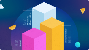
Our new website has drastically improved our user behavior analytics. Some of the analytics we achieved are:
- Sessions have increased by 11%
- Bounce Rate has decreased by 6%
- Session duration has increased by 120%
- Pages Per Session has increased by 44%

A redesign was desperately needed for our website and the results don’t lie – it drastically helped. If you have a feeling that your website isn’t properly representing your brand, communicating your message, or isn’t user-friendly, reach out to us for a consultation. We may be able to get your website the same results or even better!